The brief
The Fresh Kid is a customer experience consultant working with fashion, retail and heritage brands. The challenge was to create a personal brand that reflected both his experience and his positioning — someone equally comfortable navigating established heritage businesses and contemporary consumer culture.
The identity needed to balance sophistication with accessibility, heritage with modernity and expertise with personality. The goal was to create a brand that felt distinctive and credible without relying on the visual clichés often associated with luxury consulting or fashion.
The strategic idea
The central idea was Nú Heritage — a positioning built around the relationship between tradition and progress. Rather than choosing between heritage and contemporary culture, the brand would sit confidently between the two.
This became the organising principle for the entire identity system. Every element, from typography and colour to photography and tone of voice, was designed to express that balance. The result was a brand with a clear point of view: respectful of tradition, but focused on what comes next.
Rather than creating a visual style in isolation, the objective was to build a flexible system that could support the client's consultancy, content, presentations and future growth while remaining consistent and recognisable.
The brand needed to feel like it belonged in a private members club and a contemporary art gallery at the same time — neither anachronistic nor trend-led.
The Identity System
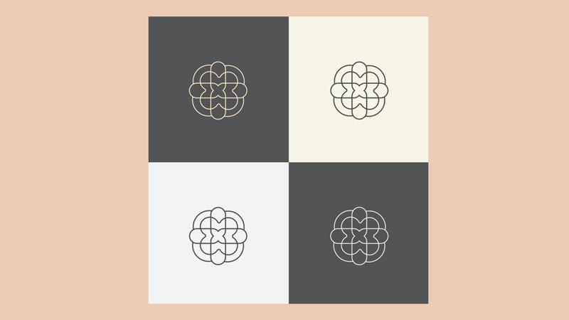
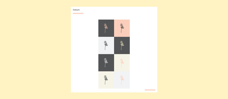
The identity was built as a complete brand system rather than a standalone logo. It combined a custom marque, a structured typographic hierarchy, a restrained colour palette and a considered photography direction, all designed to reinforce the Nú Heritage positioning.
Alongside the visual identity, I developed a comprehensive set of brand guidelines covering logo usage, typography, colour, photography, social applications and future brand development. The intention was to create a system that could be applied consistently while remaining flexible enough to evolve over time.