Packaging Design · Brand System · Amazon · Retail

Vidalforce

Packaging system and brand extension for a Spanish haircare brand expanding from a single men's product into a full gender-inclusive range — designed during lockdown for Amazon launch and retail distribution.

The brief

Vidalforce had established a successful position in the Spanish men's haircare market with a single hero product. The next stage of growth was more ambitious: expanding into a broader range of shampoos and serums aimed at both men and women, while preparing the brand for Amazon launch and wider retail distribution.

The challenge wasn't simply designing new packaging. It was creating a scalable brand system capable of supporting a growing product portfolio, differentiating multiple product lines and helping customers navigate the range quickly in both ecommerce and retail environments.

What existed before was functional but limited — a brown box, black typography and a logo. The opportunity was to transform that into a coherent brand experience that could support future growth while communicating quality, natural ingredients and a more premium market position.

The creative challenge

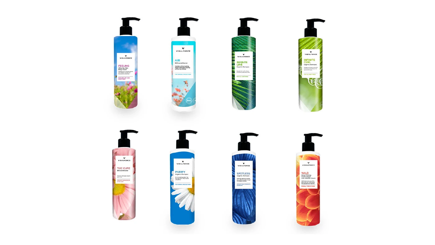
The packaging system needed to do several things simultaneously. It had to be coherent enough that the full range read as a single brand family on an Amazon listing or a retail shelf. It had to clearly differentiate men's and women's products without the two lines feeling like separate brands. And it had to feel natural and premium — appropriate for a product making a quality claim about ingredients.

The Amazon context was particularly important. Packaging that works on a physical shelf and packaging that works as a thumbnail on a product listing are not the same design problem — the thumbnail needs to communicate the product and the brand at very small sizes, which means hierarchy and clarity matter more than detail.

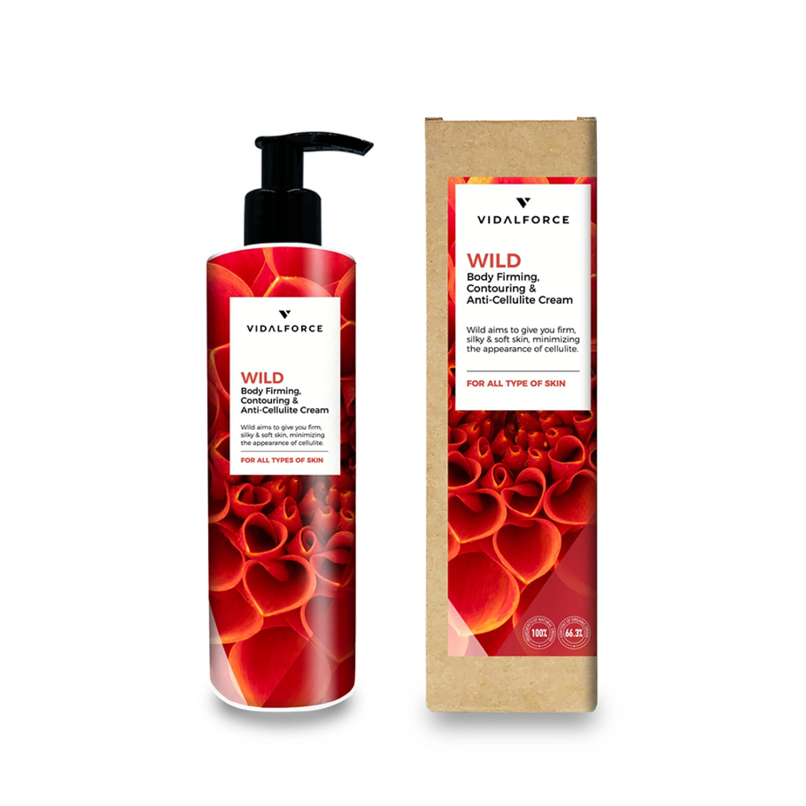
The starting point was natural flora photography — using the actual ingredients as the visual language of the brand rather than abstract design devices.

Flora photography

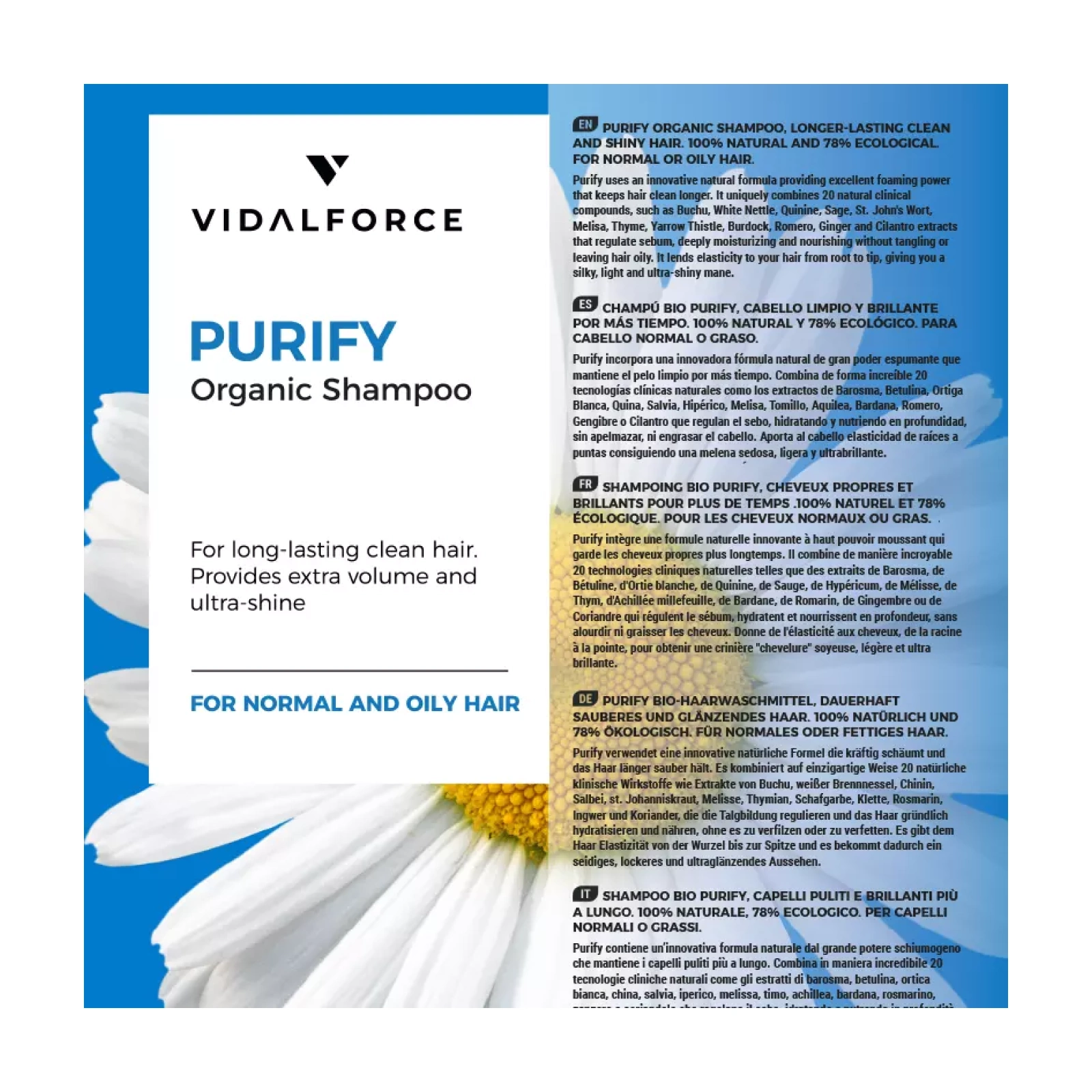
Commissioned high-quality natural ingredient photography as the primary design element — real botanicals, beautifully lit, used consistently across the range to communicate natural provenance and product quality without a single word of copy.

Colour as differentiation

Used a controlled colour system to differentiate men's and women's lines — different palettes within a shared brand architecture, so the products clearly belonged together as a range while being immediately distinguishable from each other.

Amazon-first hierarchy

Designed the packaging typographic hierarchy and layout to perform at thumbnail scale first — brand name, product name and key claim all legible at the sizes Amazon displays product images. The detail rewarded closer inspection but the essential communication worked small.

Vidalforce Full Product Range

Building the system

The packaging architecture was designed as a modular system from the start — not individual SKUs designed one at a time, but a shared structure that every product in the range would slot into. That meant establishing the grid, the typographic hierarchy, the photography treatment and the colour logic before designing a single product, so that adding new SKUs later wouldn't require redesigning from scratch.

  • Shared layout grid across all products — same structural logic, same proportions, same information hierarchy applied consistently regardless of product type or gender line.
  • Natural ingredient photography direction — worked with a photographer to capture the botanical elements specific to each product formulation, so the imagery was genuine rather than generic stock.
  • Colour palette system — developed distinct but related palettes for men's and women's lines, with enough tonal difference to differentiate clearly while keeping the brand family coherent across the full range.
  • Amazon asset production — created all the required product listing images, including lifestyle shots and detail images, designed to the specific requirements of Amazon's product page format.
  • The system was documented clearly enough that new products could be added by the brand without requiring a designer to revisit every visual decision from scratch.

The outcome

Vidalforce launched with a scalable packaging system capable of supporting a growing product range across both Amazon and retail environments. By establishing a clear brand architecture, consistent visual hierarchy and a flexible design framework, the range could expand without losing coherence or recognition.

The combination of botanical photography, structured packaging design and colour-based product differentiation created a stronger premium positioning while making the range easier to navigate for customers shopping online or in-store. Every element of the system was designed to communicate product quality, natural ingredients and brand consistency at a glance.

More broadly, the project demonstrated that packaging design for ecommerce requires a different mindset to traditional retail packaging. Customers make decisions quickly, often on mobile devices and at thumbnail size. By designing around those behaviours from the outset, the packaging system was able to work effectively across both physical and digital retail environments.

The project remains a strong example of how brand architecture, packaging systems and customer behaviour can be brought together to support product expansion and brand growth.

Vidalforce Box Detail
Vidalforce Brand Range
Next Project → Retail Scale-Up