Brand Identity · Visual Identity System · Website · Collateral

Island Estates

Island Estates wanted to establish itself as a leading estate and lettings agency in Kensington. The challenge was to create a distinctive brand identity capable of competing against larger, more established agencies while communicating the quality, confidence and ambition of the business across every customer touchpoint.

The brief

Island Estates was a successful estate and lettings agency operating in Kensington — but their branding didn't reflect either the quality of their service or the market they were working in. The owner had a clear ambition: he wanted to be the biggest agent in the area. What he had was generic estate agent branding that looked like everyone else on the street.

He came to me with one idea: he wanted a lion in the logo. He had an instinct that it should be bold and distinctive. Everything else was mine to figure out.

The creative approach

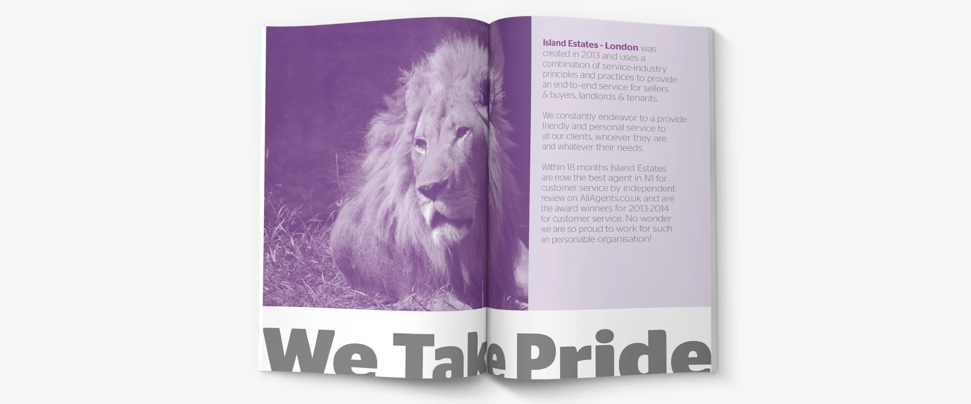
The lion wasn't just a logo element — it became the organising idea for the entire brand identity. In Kensington, with its royal associations and established heritage, a lion made sense as more than a symbol. It communicated authority, quality and ambition without needing to explain itself.

The challenge was to build a complete visual identity system around that idea — one that could work across every format the business needed, from a small business card to a full-height window display, from a property board on a Kensington street to a website competing with significantly larger agencies.

The lion wasn't a logo — it was the organising principle for the entire brand. Every decision flowed from it.

Identity system

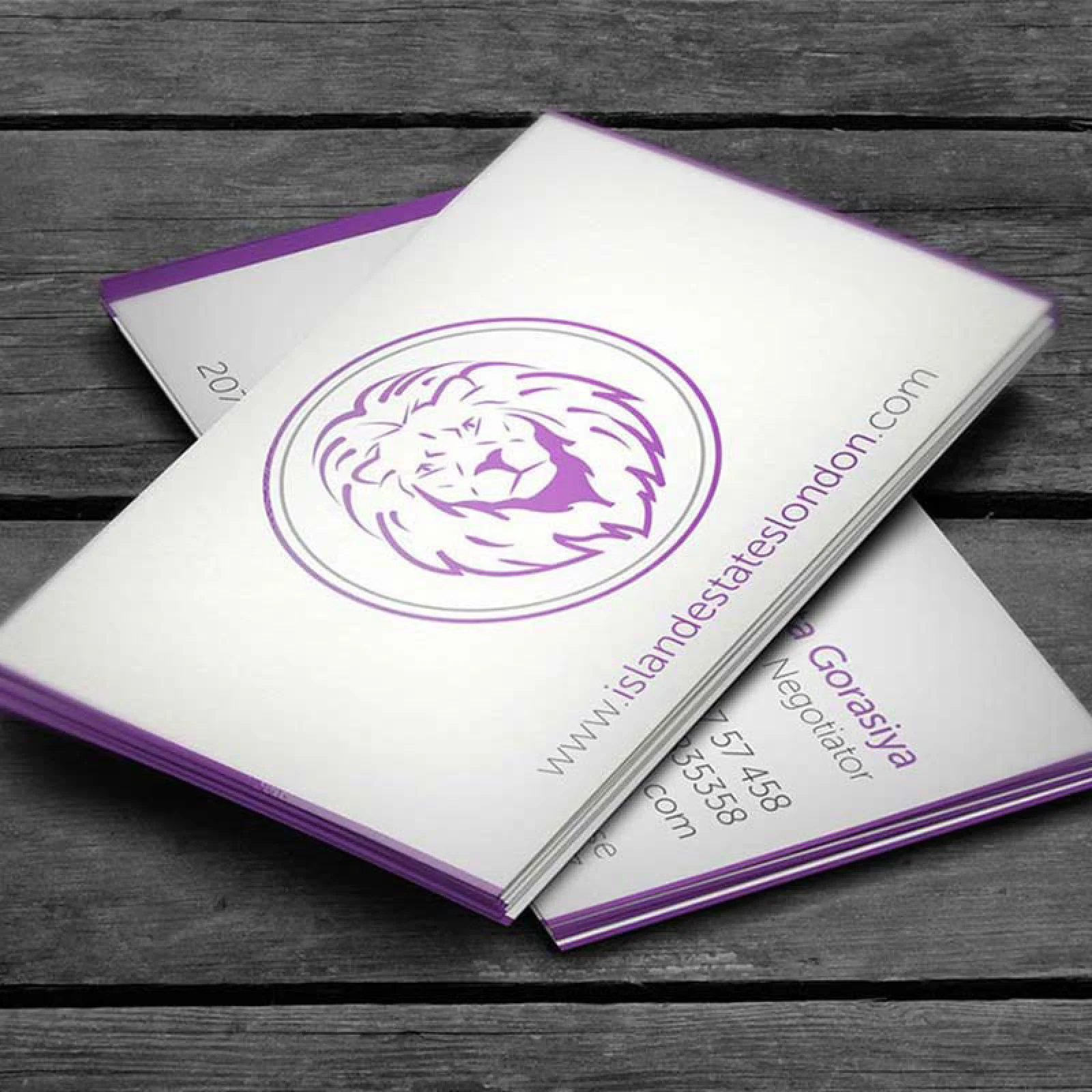
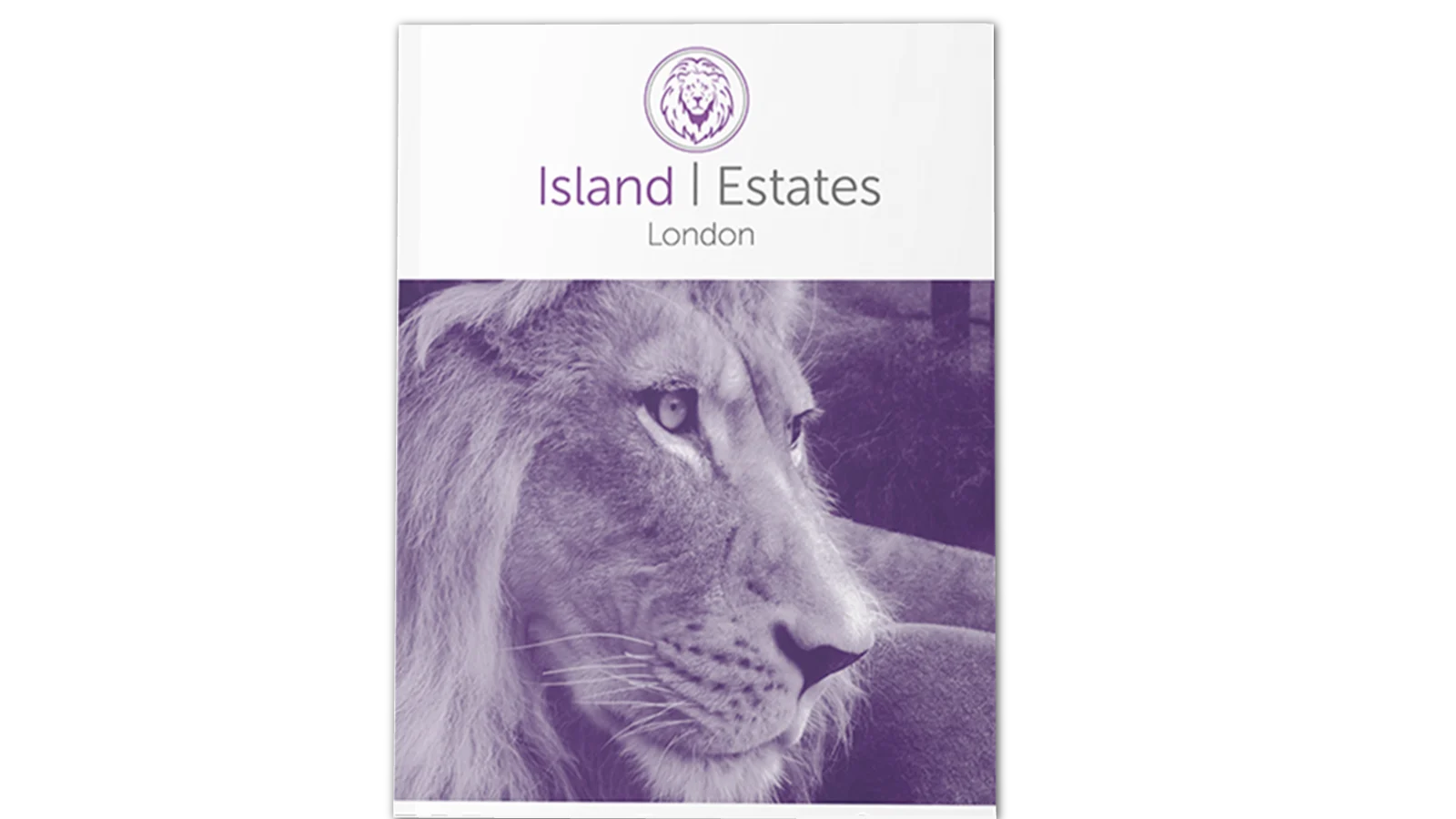
Developed a complete visual identity built around the lion marque — typography, colour palette, grid system and brand guidelines that gave the business a coherent design language across all applications.

Print & collateral

Designed stationery, property brochures, signage and for-sale boards that applied the identity consistently — so the brand built recognition every time it appeared on a Kensington street or letterbox.

Digital presence

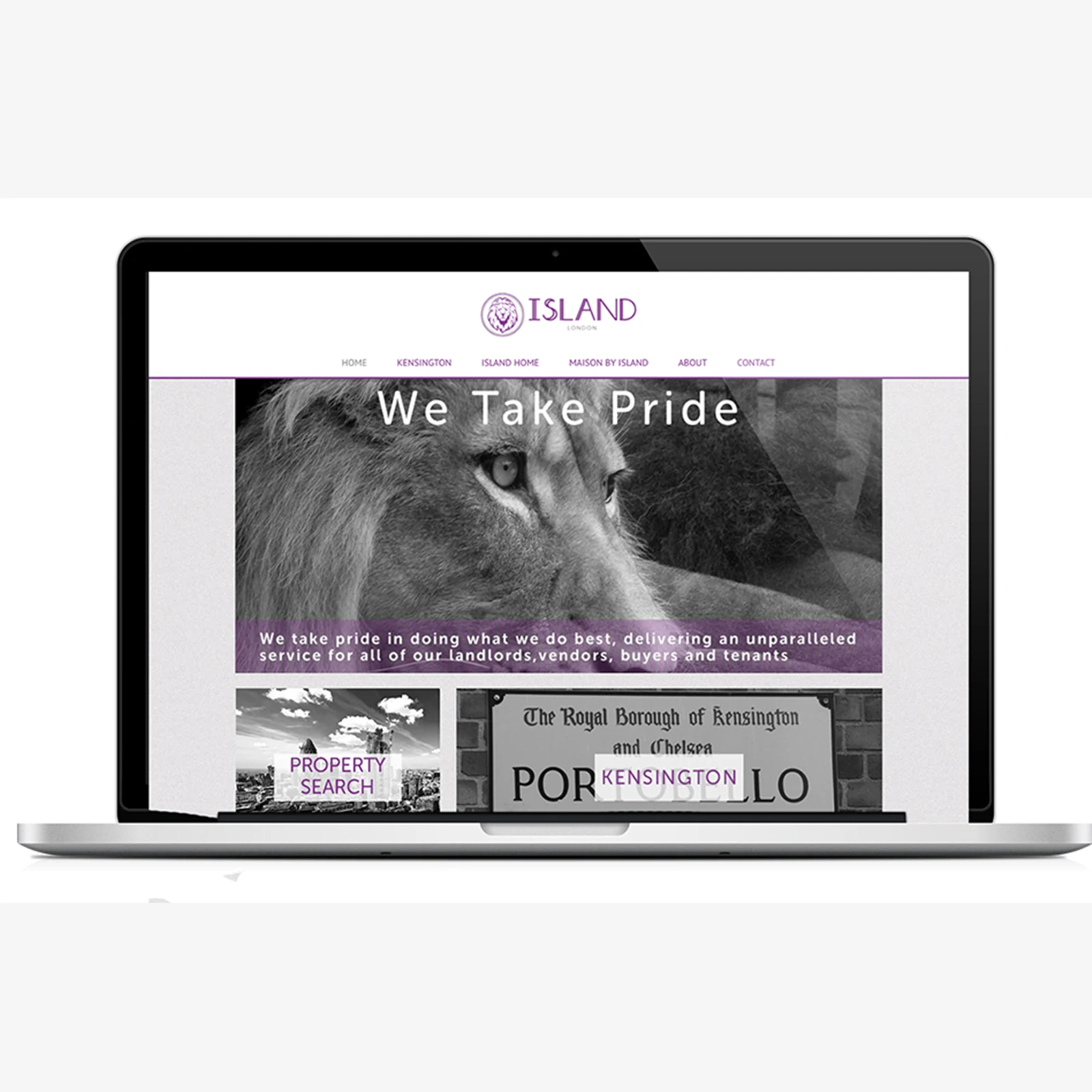
Designed and built a website that brought the same visual language online — clean, property-focused, and positioned to compete with much larger agencies in the area.

Island Estates Brand Application

Making the identity work across everything

The real test of a brand identity in property is whether it holds up in the real world — on a board outside a house, on a brochure handed to a potential buyer, on a window display in a competitive high street. Generic estate agent branding fails that test because it's designed to be inoffensive rather than memorable.

Every visual decision was made with a specific application in mind. The logo mark was drawn to reproduce cleanly at any scale — from a small favicon to a full-height window display — which meant keeping it bold and uncluttered rather than detailed. The typographic system paired a classical serif for headings with a clean sans for body copy: the serif carried the sense of heritage and establishment that Kensington clients would expect, the sans kept it from feeling stuffy or dated. The colour palette was chosen to stand out on a street where most competitors were using the same predictable navy and cream.

  • Logo and marque engineered to work across all reproduction methods — digital, print, signage and embossing.
  • Property brochures designed with a modular layout system that worked consistently across different property types and price points.
  • Brand guidelines developed so the identity could be applied correctly by printers, signage companies and developers without needing constant supervision.
  • Website designed to sit credibly alongside much larger agencies, with clear navigation and a property search experience appropriate for the Kensington market.

The outcome

The rebrand provided Island Estates with a distinctive visual identity capable of competing in one of London's most competitive property markets. By building the entire system around a single organising idea, the brand was able to create recognition and consistency across every customer touchpoint, from property boards and brochures to signage and digital experiences.

Rather than relying on generic estate agency conventions, the identity established a stronger sense of authority, quality and ambition while remaining practical enough to work across a wide range of applications. The result was a brand system that could scale with the business and be applied consistently without requiring ongoing creative oversight.

More broadly, the project demonstrated the value of building brands around a clear strategic idea rather than a collection of visual assets. When the core concept is strong enough, every design decision becomes easier, every touchpoint feels more coherent and the brand becomes more memorable as a result.

Although this was an early freelance project, the principle behind it remains central to how I approach branding today: the strongest identities are rarely the most complicated. They're the ones built around a simple idea that can be applied consistently across every customer interaction.

Island Estates Stationery
Island Estates Website
Next Project → MyStylist